
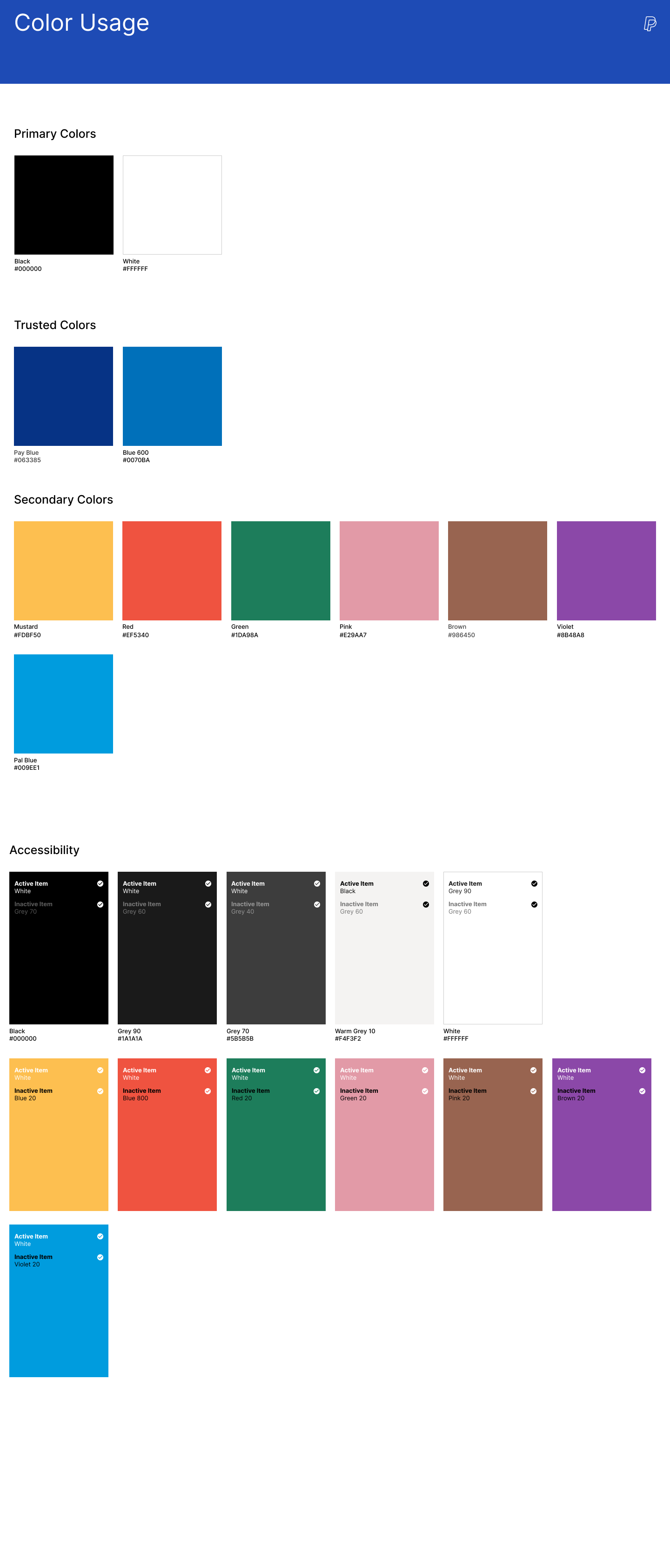
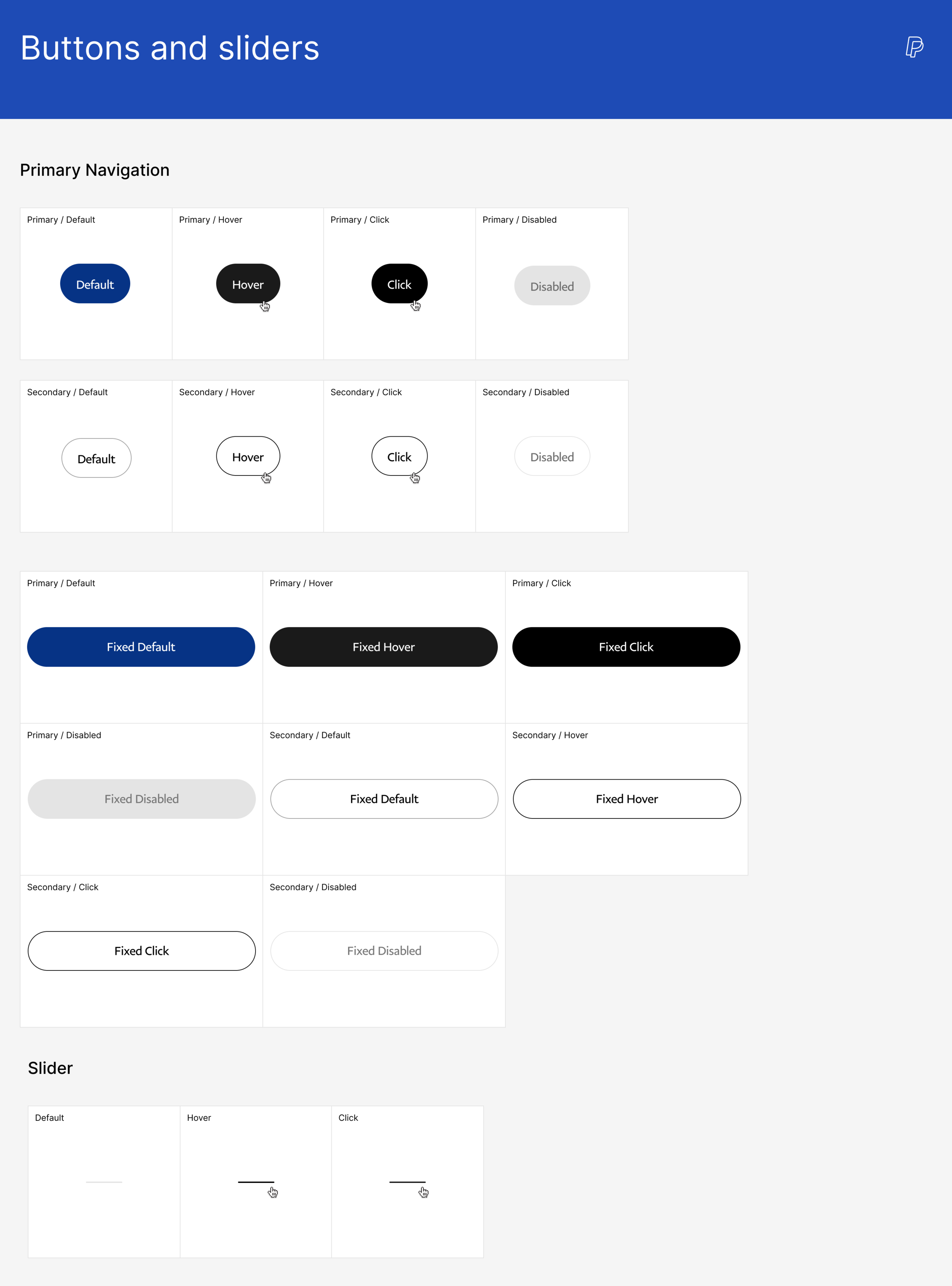
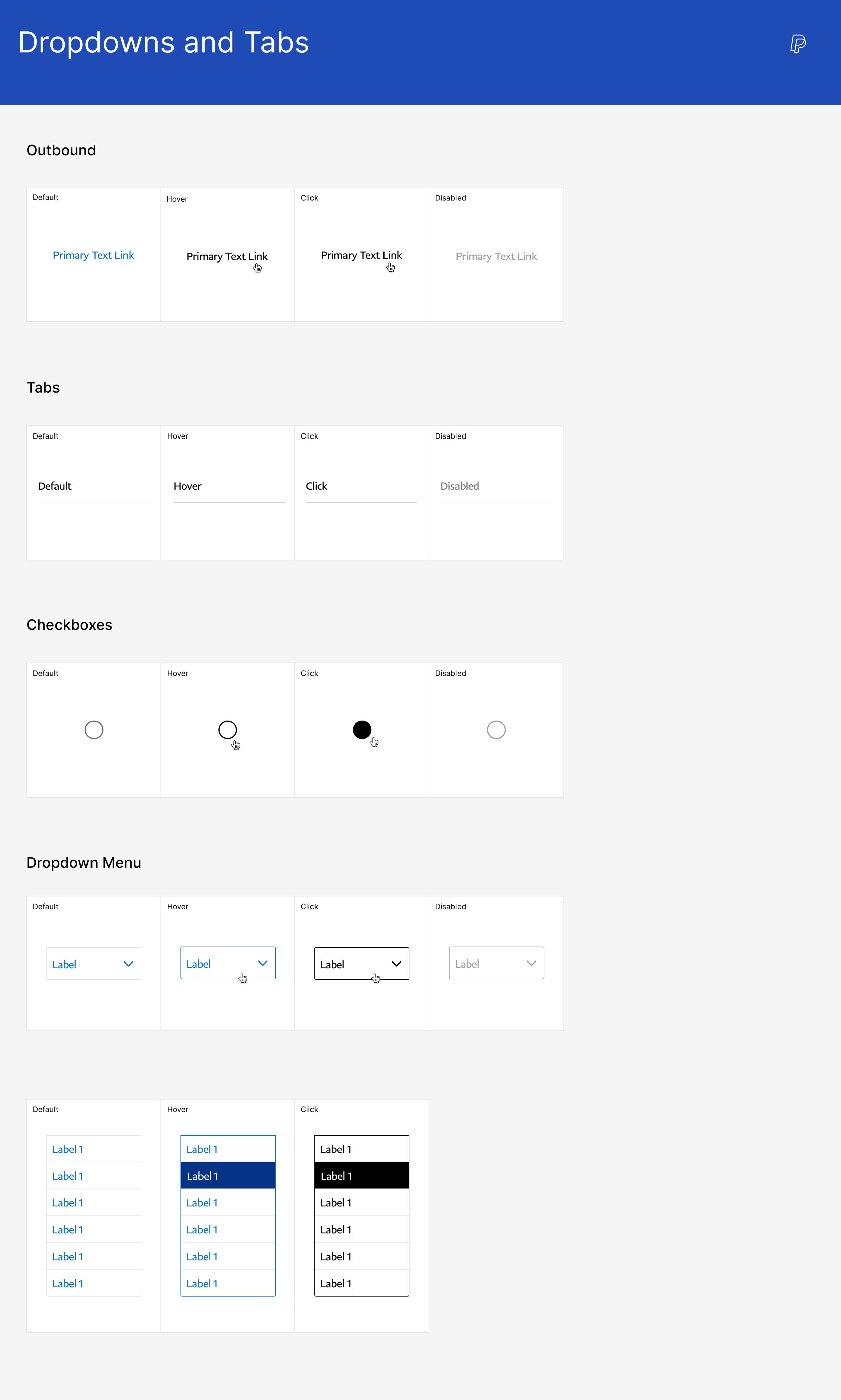
PayPal
REDESIGNING THE LOGGED OUT EXPERIENCE OF PAYPAL.COM
Please note: All artifacts below are intellectual property of AKQA Inc and under non disclosure agreement with PayPal. Duplication or sharing of any of the information presented in the case study below without written consent is prohibited.
The ChallengE
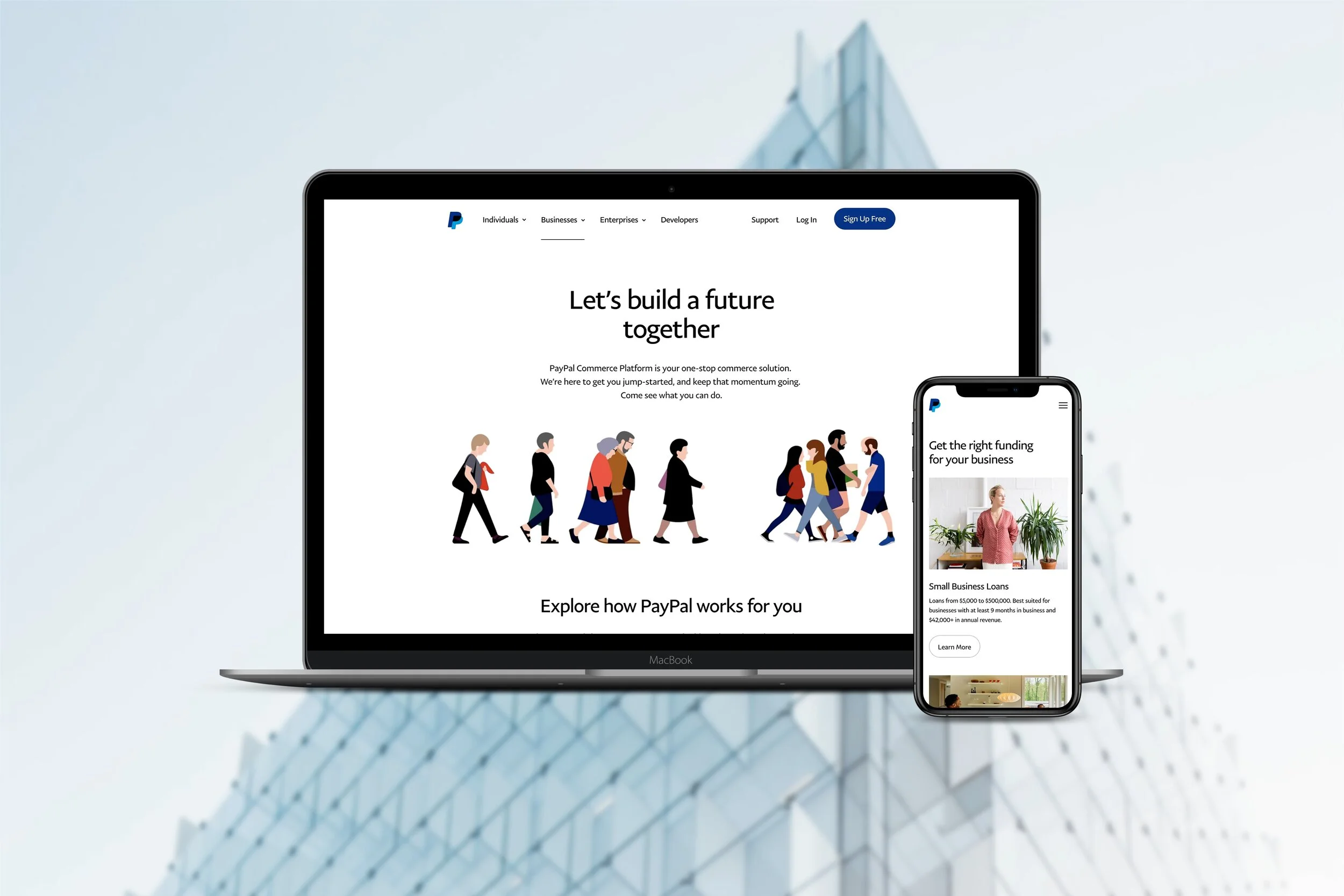
PayPal is a payments solution leader currently known for the “PayPal button” and not much else. They needed a way to communicate their other offerings and fix the fragmented experience of their website. The scope of work was for the US logged out experience for consumers, businesses, and developers.
GOALS
Shift the experience from transactional and complex to delightful and rewarding
Create a cohesive, simple, and intuitive experience for PayPal merchants, consumers, and developers
Utilize modular, yet personalized, page design for scalability
Increase conversion ( measured by sign-up clicks)
Discovery
When PayPal came to us with their project proposal, they knew that they needed to raise awareness for their products. Additionally, they wanted to establish themselves as the all-in-one solutions leader for merchants through their ‘PayPal Commerce Platform’.
Ecosystem analysis
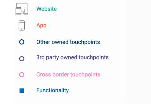
To get a comprehensive understanding of PayPal’s interconnected properties, we mapped out an ecosystem across 3 verticals for both consumers and merchants. From this exercise, we were able to visualize the level of integration between properties, services and touch points to inform the future state and role of PayPal.com.
The main takeaways:
PayPal offers customers similar functionality across different brands - making it impossible for customers to understand the breadth of product offerings and compare them
Large areas of coverage rely heavily on partnerships and integrations, limiting PayPal’s ability to control of the user experience thus creating fragmentation
Research
Heuristic evaluation
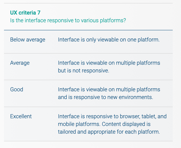
Our goal was to identify key areas for UX improvements with a thorough heuristic evaluation of the logged out experience. Our framework looked at the effectiveness of CTAs, navigation, interaction, responsiveness, and more. Each criteria was rated on a scale of 1 (“Below average”) to 4 (“Excellent”) and tallied up to visualize the performance of PayPal.com as it currently exists.
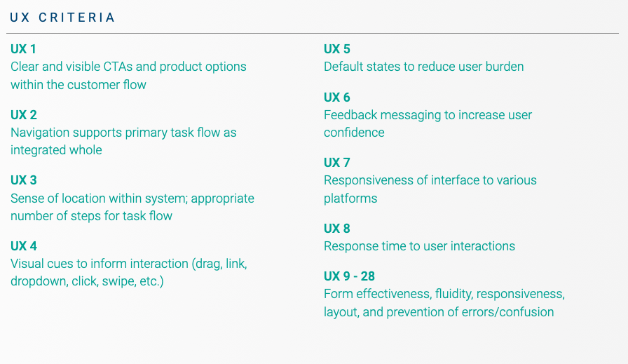
Summary of topics covered in UX Criteria. Full Heuristic worksheet available upon request.
Each criteria was rated using a scale of below avg. to excellent (1 -4)
We determined the areas for most improvement were navigation, feedback, and responsiveness. Visual aspects were also evaluated using the same “1 to 4” scale but with specific design related criteria. The results were as follows:
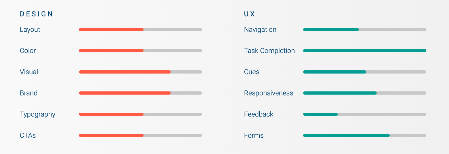
We hoped that by finding areas of improvement, we could redesign and help increase PayPal’s customer retention rate and overall customer satisfaction rating.
One of the substantial changes that needed to take place was a reimagination of the navigation menu and its functionality. The current navigation did not reflect the depth of the website’s offerings and was not intuitive. The website lacked breadcrumbs or other navigation identifiers to help users understand their relative location on the website.
Additionally, feedback forms did not provide helpful messages for users to complete tasks and prevent errors.
A full look at PayPal’s UX and ecosystem helped us familiarize ourselves with the company. It was clear that PayPal has a large landscape of products that could not be easily compared to any other company. To account for this, we looked at competitors for each of PayPal’s major offerings.
Competitive Audit
The competitive analysis took place with two main focuses:
1) looking at best practice examples of overall website functionality and design
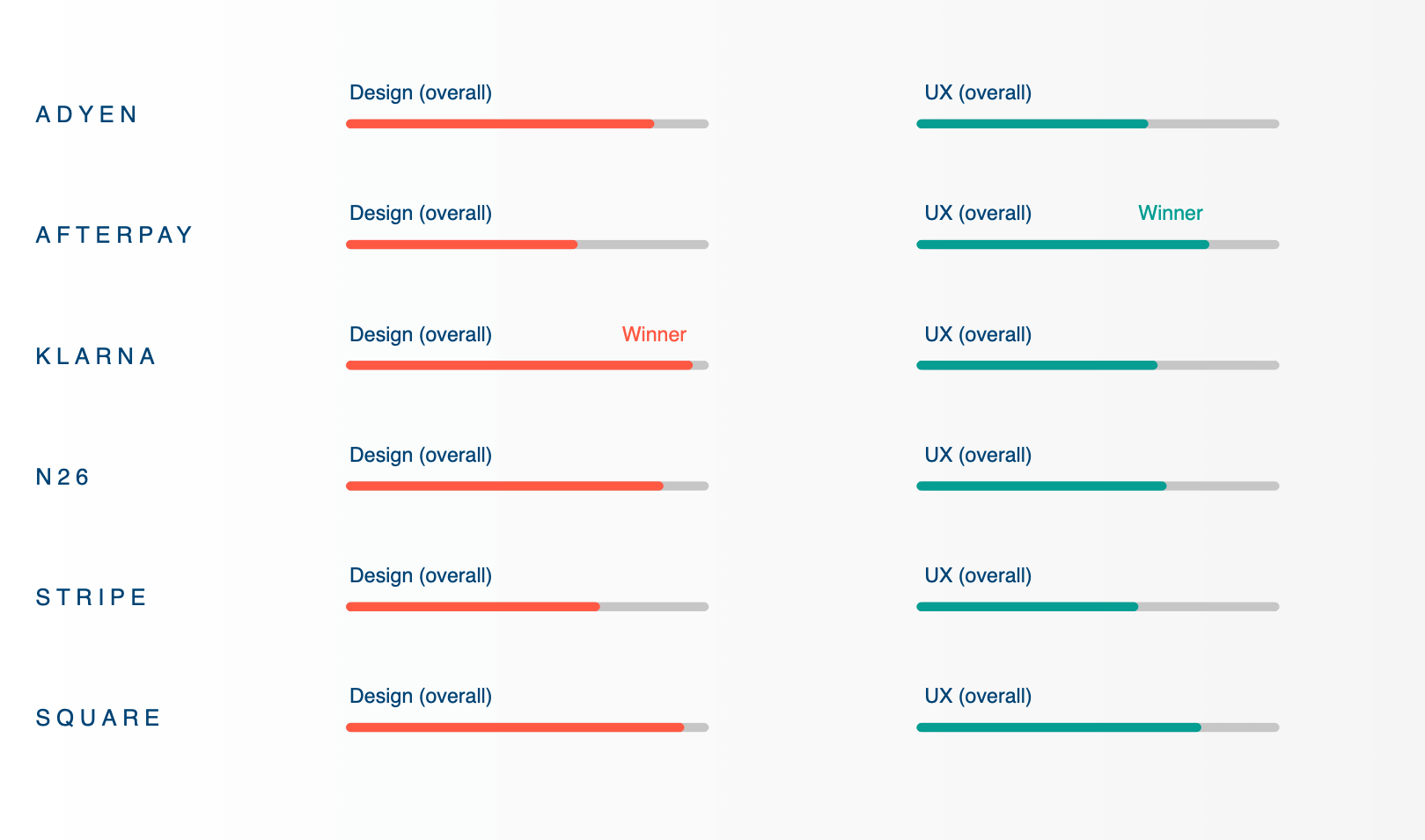
2) a full heuristic analysis of 6 chosen competitors using the same framework we evaluated PayPal with.
First, we looked at 25+ competitors across industry sectors, searching for best-in-class examples of content and functionalities that relate to key audience needs and opportunities.
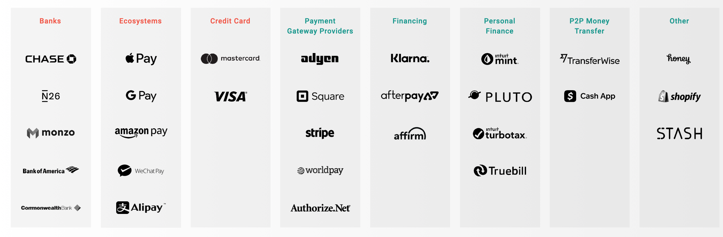
While many companies are best in class for certain content and functionalities, not one single competitor is owning the entire customer experience.
Among consumer competitors, neo-banks like N26 and Monzo excel in total money management, while personal finance tools like Mint excel in financial health overviews and personalized recommendations.
Under merchant competitors, Square, Stripe and Adyen are superior in product clarity and in helping merchants on their journey from start-up to scaling their business. They also succeed in developer-centric content and design. The competitors that stood out contained the following themes of excellence:
Themes of excellence among competitors
In the heuristic part of the competitor evaluation, Klarna emerged as the winner in the design criteria while Afterpay had the best UX overall.
INTERNAL STAKEholder interviews
We conducted 23 one-on-one and group interviews across PayPal’s credit, product, sales, marketing, creative, UX, customer service, and social cause departments. We sought to learn about how they saw PayPal.com improving and what it needed to prioritize in the future. Questions revolved around the following:
○ Business and brand objectives
○ Customer needs and pain points
○ Marketing ecosystem and channel strategy
○ Competition and trends
After speaking with the employees, we discovered that stakeholders did not believe the site today best reflected the company and its goals, its value to consumers and merchants, or its product offerings.
Many of the business units share the same goals for the site: to clearly state the value proposition, efficiently and effectively use data, and create a more holistic experience reflective of need. Through the interviews, we were able to better empathize with each department and all the stakeholders as a whole.
We bubbled up the most commonly heard thoughts into 5 key shared goals for the site overall:
Along with the overarching goals above, the interviewees also expressed the need for intuitive utility, simplicity, and consistency across the website.
Personas & SEO mapping
Working with our strategy and SEO team, we combined our stakeholder interview findings with search term data to create mind maps. This helped us piece together the way PayPal’s customers think and understand their goals, needs, and pain points.
The main audiences for PayPal’s website are consumers, merchants, and developers. Based on their familiarity with PayPal, business size, or experience as a payments developer, we created sub-personas. Below is a sample persona created for a small business owner, a sub-persona of the merchant.
Personas
Consumers
Digital native
Value seeker
Planner
Lapsed consumer
Developers
Start up developer
Mid market developer
Enterprise developer
Merchants
Small business owner (pictured below)
Mid market merchant
Enterprise merchant
One of the 10 personas developed
To empathize with Janet, we created a mind map of the highest searched key words (pictured in grey below) and laddered them up into common themes to come up with 4 main things that a small business owner would be most interested in: getting paid, credit and loans, business set up, and sales. This helps inform the content priority in the website redesign.
SEO Mind Map for Small business owner
We gathered 1) all the information from our own research with 2) the customer related information from our stakeholders at PayPal and created a merchant journey. It was illustrated through the stages of the business cycle: Start, run, grow, thrive. By identifying merchant needs and pains, we were able to pinpoint potential features and content to incorporate into the design stage.
Information Architecture
Tree testing
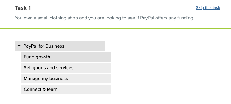
We collaborated closely with the UX team at PayPal throughout the duration of this project. They conducted card sorting exercises in-house to create more intuitive navigation options. We took the card sorting results and explored further options for the IA buckets.
Our goal was to test and validate the labelling and organization of the proposed IA to see if people could easily find the information they needed. The IA strategy also had to be scalable for future PayPal offerings. We conducted remote, moderated tree testing using Optimal Sort to determine the effectiveness of the proposed menu items.
Participants were tasked with reading a scenario and clicking where they believed the information would be. They were asked to think out loud while completing the exercises and to rate the level of difficulty after each question. This would help us determine how intuitive the menu item groupings were.
Additionally, we looked at patterns in the clicking order that the participants selected based on what their gut choice was. It was an iterative process where we made small improvements based on user feedback between each round (one round = one audience group) of testing. This was to ensure that we would end up with the most ideal taxonomy in the end.
Stimuli (entered into OptimalSort tool):
Use case based taxonomy - menu items organized by use case ( i.e. fund growth, sell goods and services, manage my business)
Stage based taxonomy - menu items organized by stages ( i.e. for businesses: set up, operate, grow)
Topic based taxonomy - menu items organized by topic ( i.e. Financial planning, money management)
Recruiting Criteria:
Mix of ages between 21-60
Mix of male / female
Mix of industry experience levels
Mix of US geographic regions
Participant Mix:
7 Merchants (3 SMB, 3 MM, 1 LE)
5 Consumers (3 “Casual Sellers”; range of familiarity with PayPal)
8 Developers (Start-up, freelance, enterprise)
Measurements of success:
% of ‘correct’ paths taken
Self perceived level of difficulty ( rate on scale of 1 - 5 )
# of tries before deciding on an answer
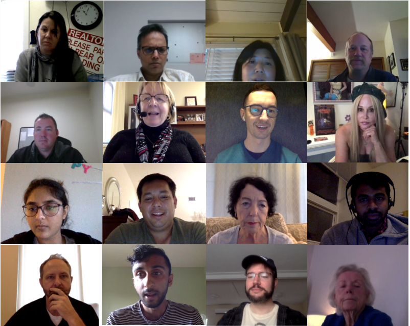
A collage of some of the participants we spoke to
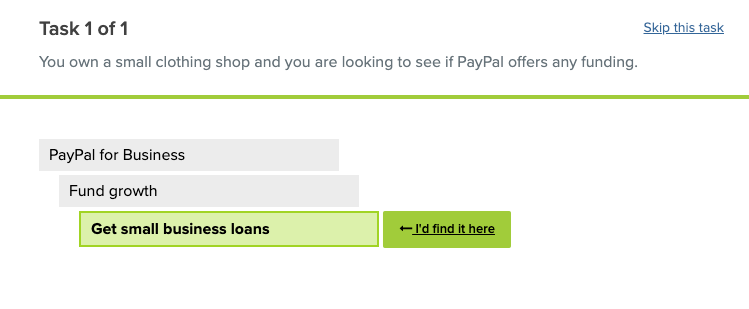
Results
The use-case based taxonomy came out on top with 100% of consumers, 86% of merchants, 50% of developers choosing it as their favorite/most intuitive .
Once our analysis was complete, we got a better picture of customers’ mental models to create a sitemap that would make the most sense to them.
What users said
“I like when I don’t have to do more than 2 clicks to get where I need to go
”
“[The Use Case paradigm] says I’m coming to PayPal for a reason. It speaks to me right away - asks who I am and what transaction I want.”
Learnings based on user feedback and observation:
Build an IA that is flat - no more than 3 layers deep at any point
Avoid using vague words - (‘Credit and debit cards’ can be unclear to business owners because its not clear if it is referring to a card for themselves or for their customer)
Avoid abstract product names in the main menu - the majority of participants are unfamiliar with PayPal’s offerings like paying with cash (PayPal Cash Card) or pooling money (PayPal Money Pool)
Group content in mutually exclusive categories - users struggled when having to choose a path among overlapping categories such as “buy & sell” (broad) and “send & receive money” (narrow)
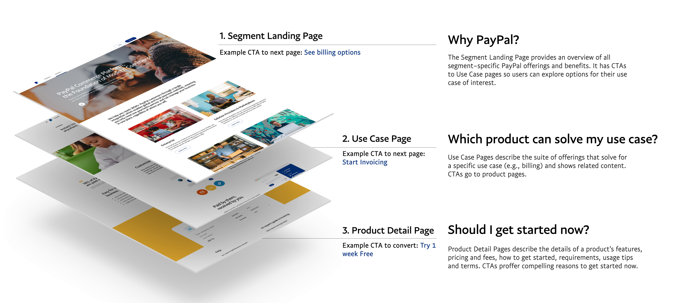
SITEMAP
We listened to user feedback to correct any confusing terminology or menu paths. With the updates, we iterated and created a sitemap for the new website.
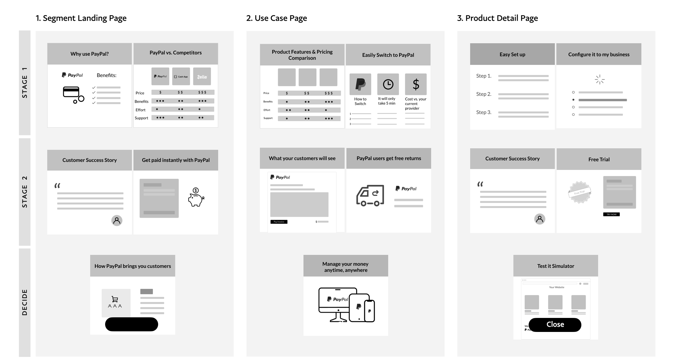
Continuing to use our flat IA with 4 page levels ( Homepage, segment landing page, use case page, and product detail page), the structure of the site would appear like so.
Please note: the below is for illustrative purposes only and this is not the final mock up of the website.
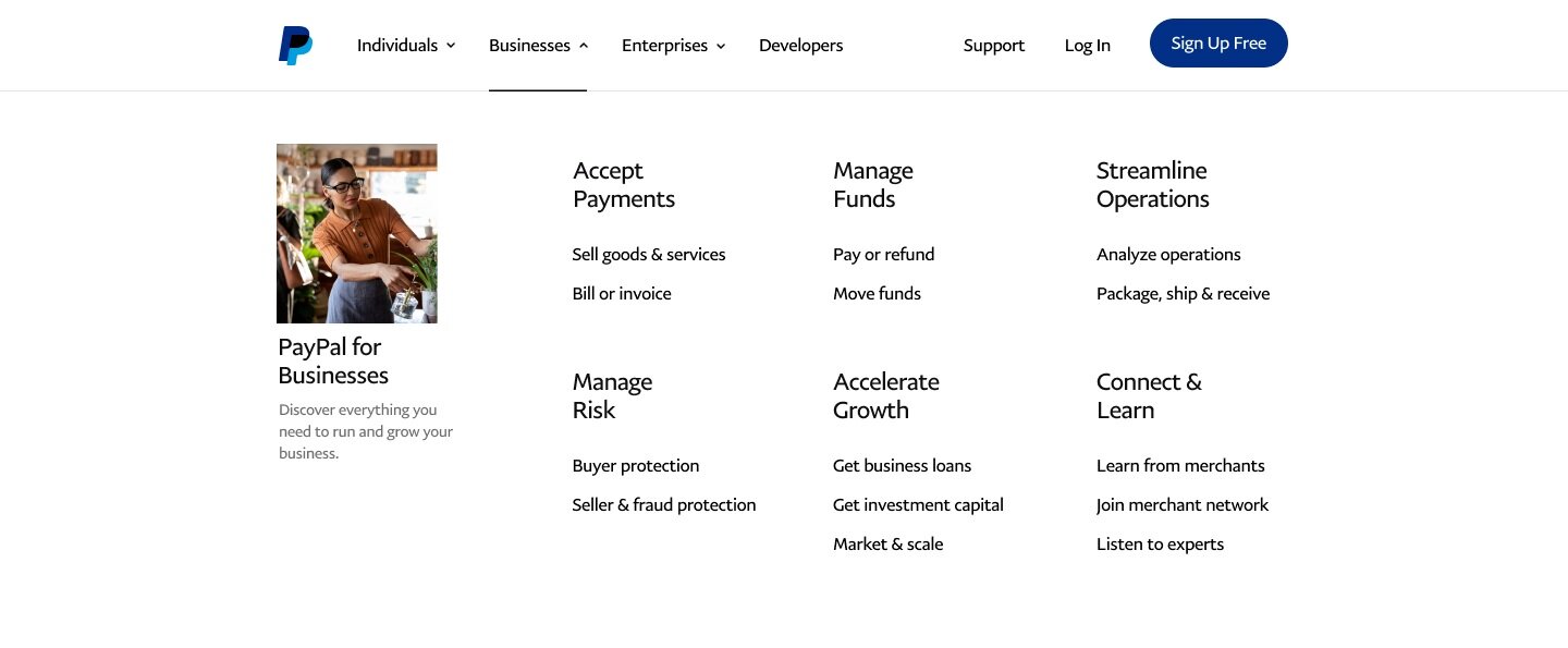
NAVIGATION REDESIGN
As you may recall during our heuristic evaluation, the navigation was functioning poorly. Using the results of our testing, we redesigned the navigation around the use-case approach and placed it into a mega-menu so that users could see all their options at once.
Before (desktop):
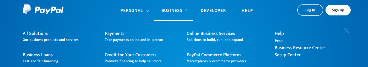
After (desktop):
Concept and content testing
We collaborated with our content team and reviewed our findings from stakeholder interviews, user interviews and surveys to determine an exhaustive list of relevant types of content to inform our first round of wireframes.
We wanted to further validate the content by testing PayPal customers at the PayPal experience lab. The sessions were moderated and were a mix of in-person and remote. The idea was to have participants do a co-creation exercise to illustrate their decision journeys using cards, each representing a specific type of content such as customer contact options or video tutorials.
Methodology:
Users were asked to select the cards they felt they needed in order to make a conversion decision and organize them by the stages of their decision making process. They were then asked to sort the cards they selected for each stage in descending order of importance. We moderated and probed on why the cards were selected and why they were organized in a particular way. Audio, video as well as the participants’ screens were recorded and live streamed to observers (PayPal stakeholders + other AKQA team members).
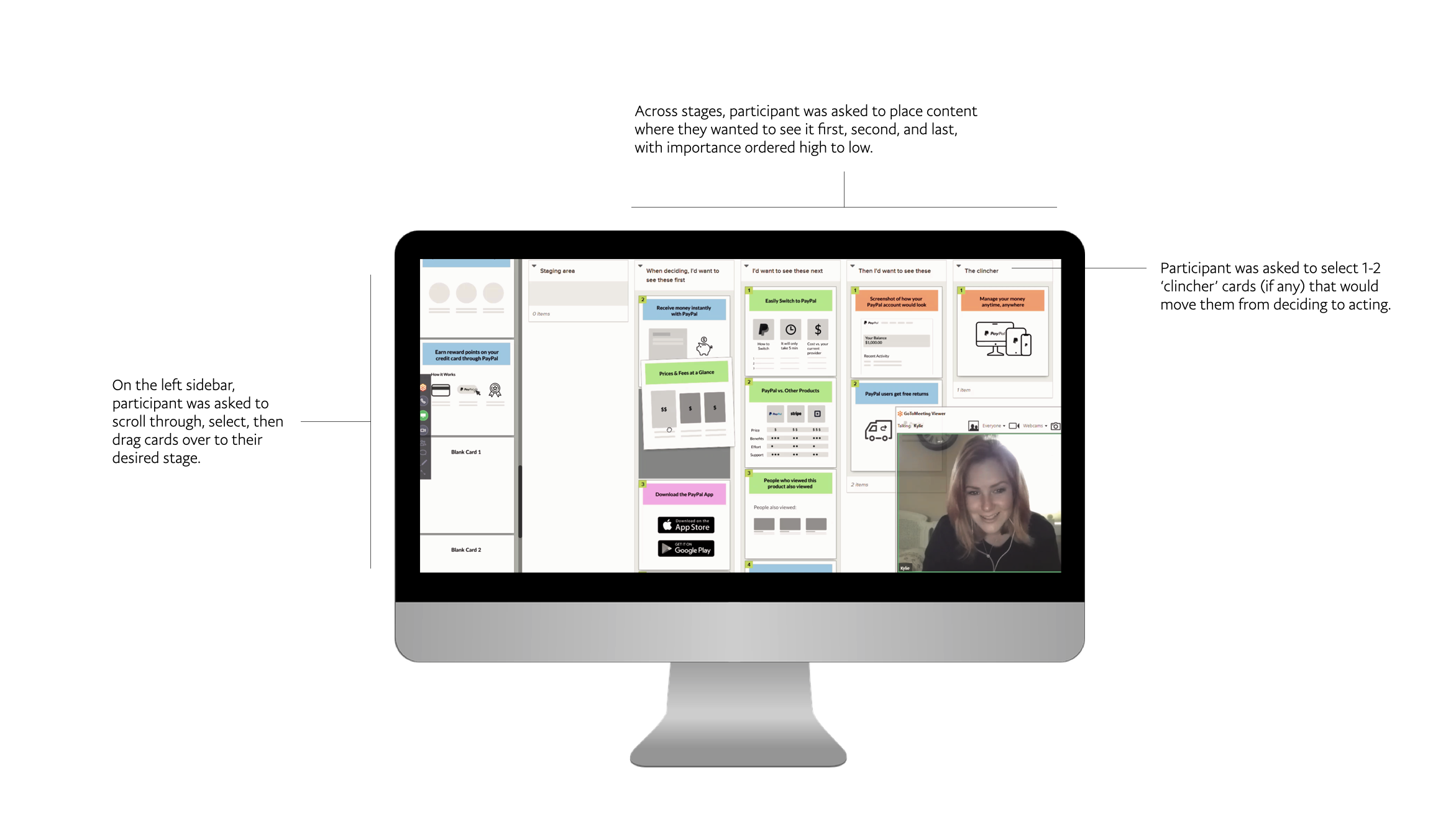
Tasks:
Based on SEO data on the top search terms by segment, we developed three decision archetypes and translated them into scenarios for participants to react to. The three decision archetypes and scenarios were: 1) whether to use PayPal, 2) which solution to select for a given use case and 3) whether to get started now.
Participant Mix:
6 Developers, ages 30 to 50 (Mix of experience levels with PayPal integrations and size of company):
2 Large Enterprise
2 Start-up
1 Mid-Market
1 Freelancer
12 Consumers, ages 21 to 65
2 “One and Done” — Lapsed users that serve as proxy for prospective customers
2 “Financially Underserved” — Lower income users (PayPal focus area)
5 “PayPal Credit” — Users who have PayPal Credit (PayPal focus area)
3 “Casual Sellers” — Consumers who demonstrate business needs
6 SMBs, ages 25 to 55
Mix of PayPal product usage levels and size of business
Stimuli Cards:
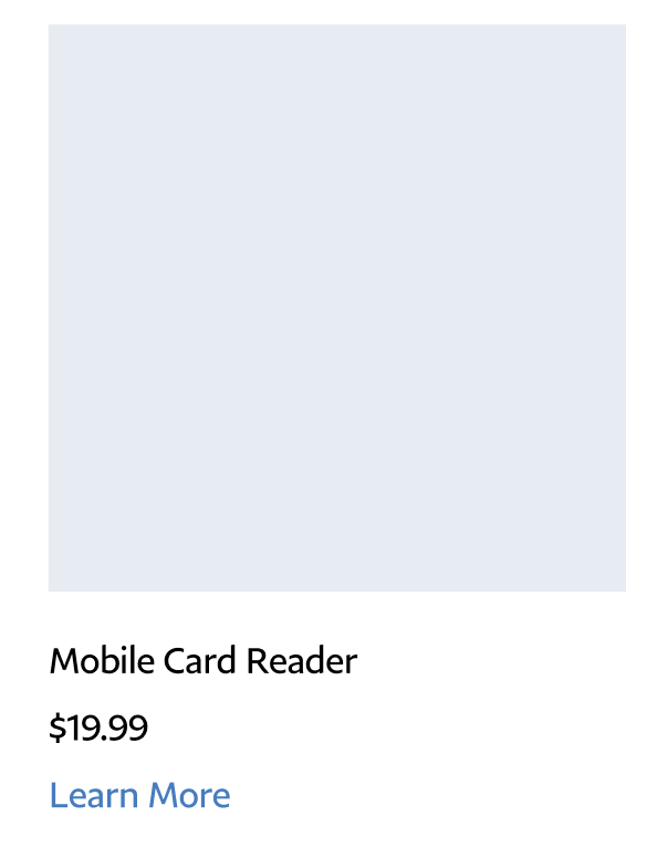
3 varying sets of content cards were created (about 120 cards total were created for consumers, merchants, and developers). Below is an example of a few merchant cards.
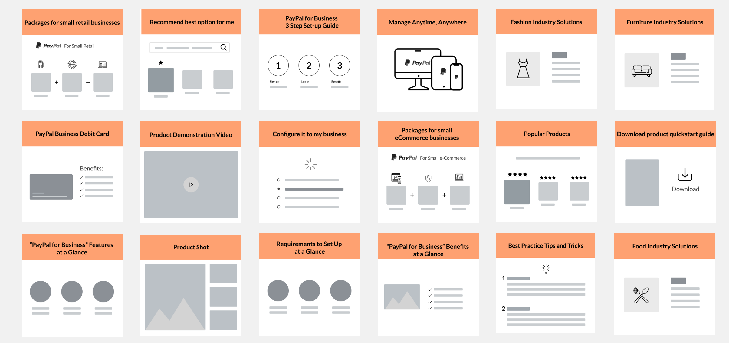
Cards were created using Figma
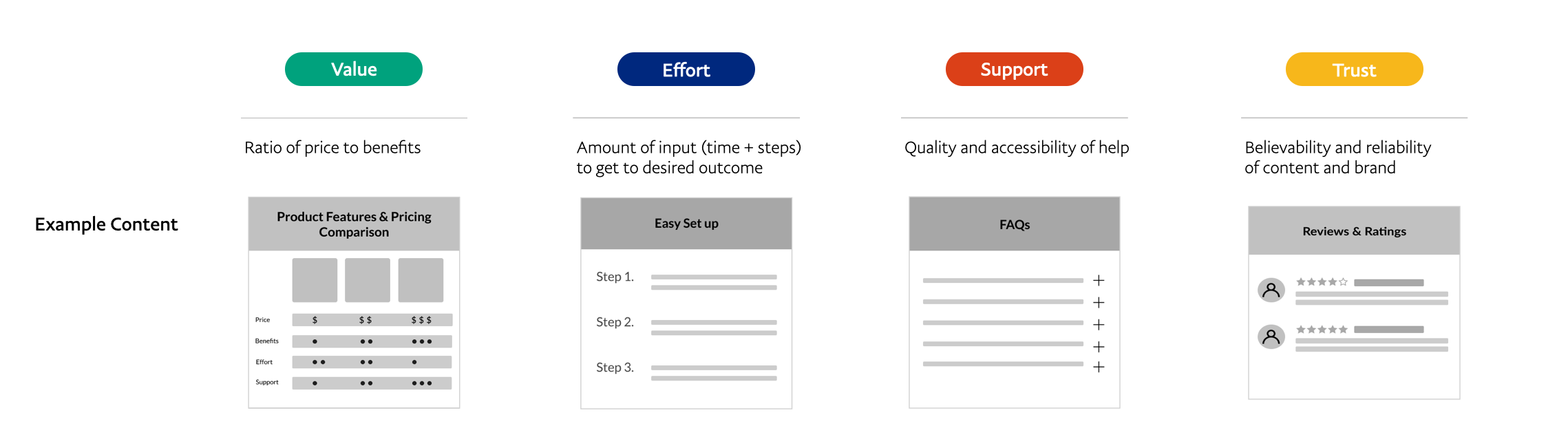
Among our team, we labeled each card with a decision criteria : value, effort, support, or trust. We did not let the participants know what any of the colors meant and they were asked to ignore the colors during their tasks.
Guests were welcomed into the waiting room
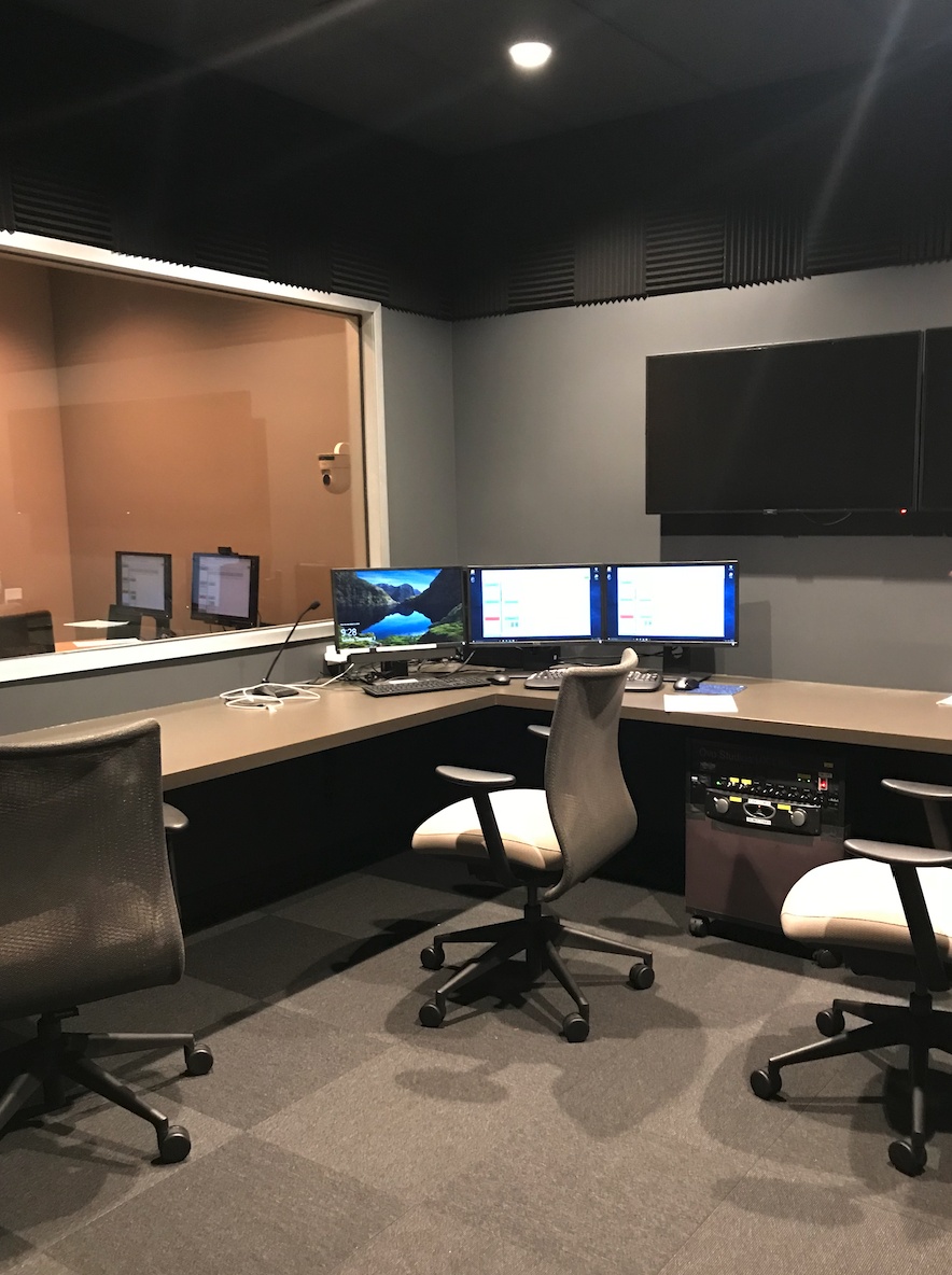
PayPal Customer experience observation room where we observed participants completing tasks
Results
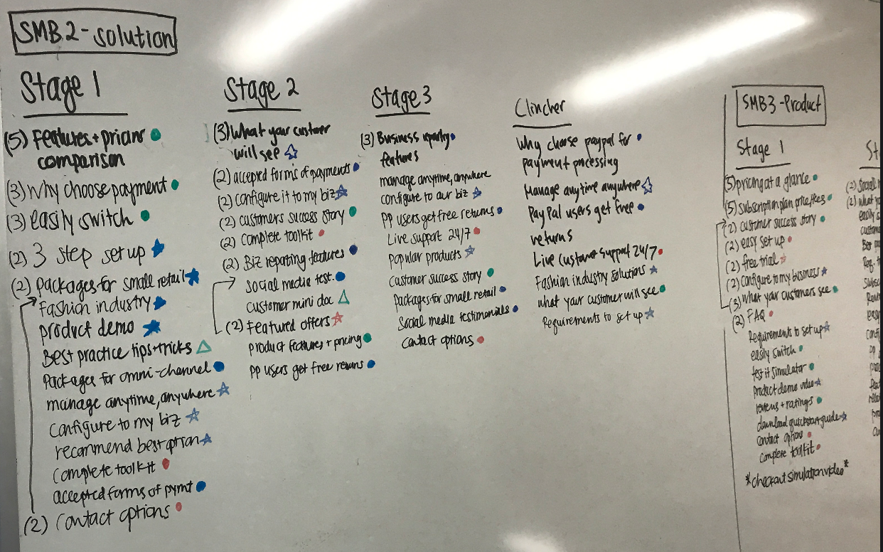
We tallied up the top cards across the participants by segment using both whiteboarding and the in program analysis tools to come up with a recommended content hierarchy to inform our wireframes.
Interaction Design
ATOmIC DESIGN
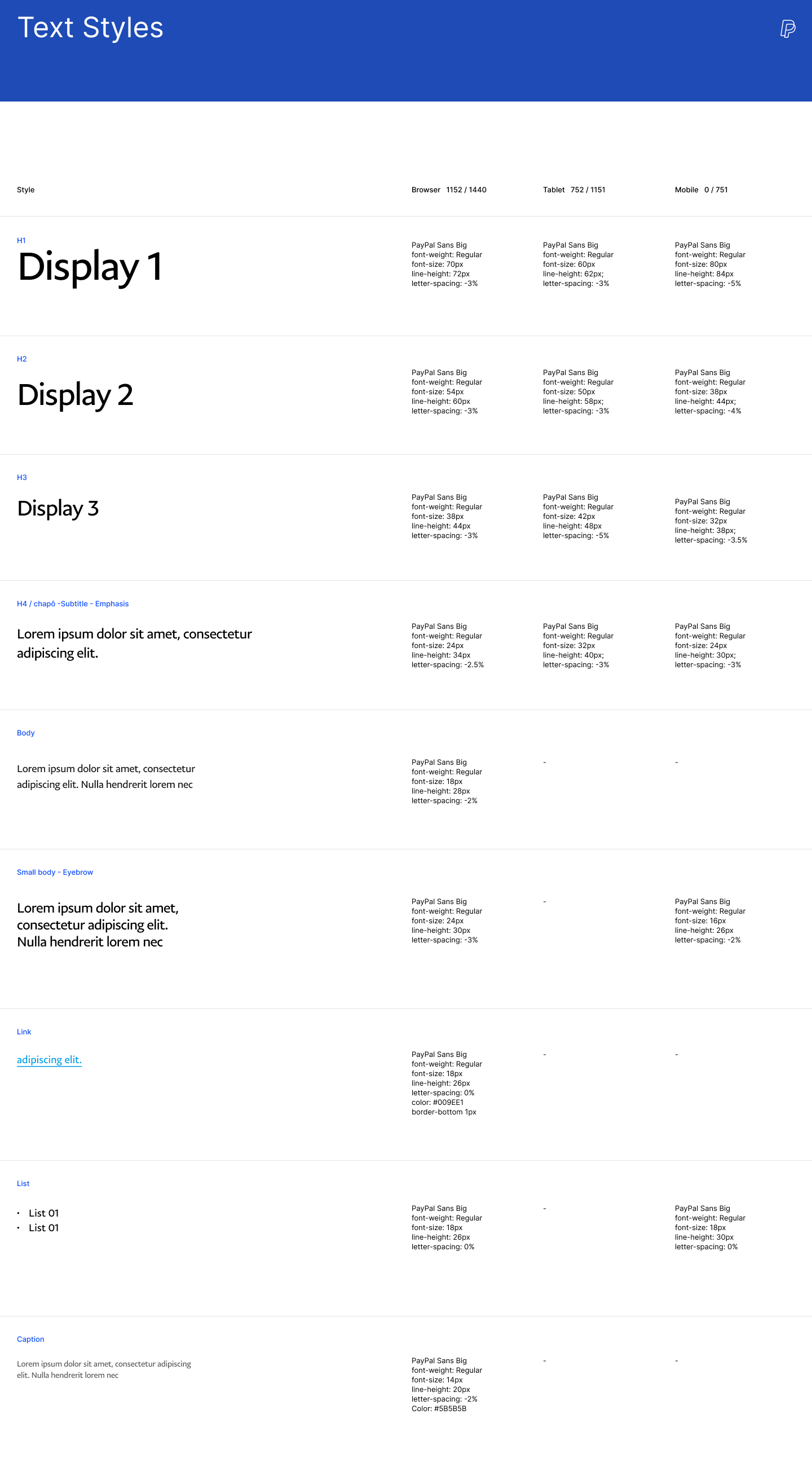
Using the atomic design methodology, we created “molecules” or simple groups of UI elements functioning together as a unit. From these molecules, we built out “organisms” or components. After creating 30 reusable molecules, we conceptualized and designed our wireframes. We decided to use modular design to make it scalable for PayPal as the business grows and because they had plans to also redesign their international websites in the near future.
Molecule
Organism made up of molecules
LOW to mid FIDELITY WIREFRAMES
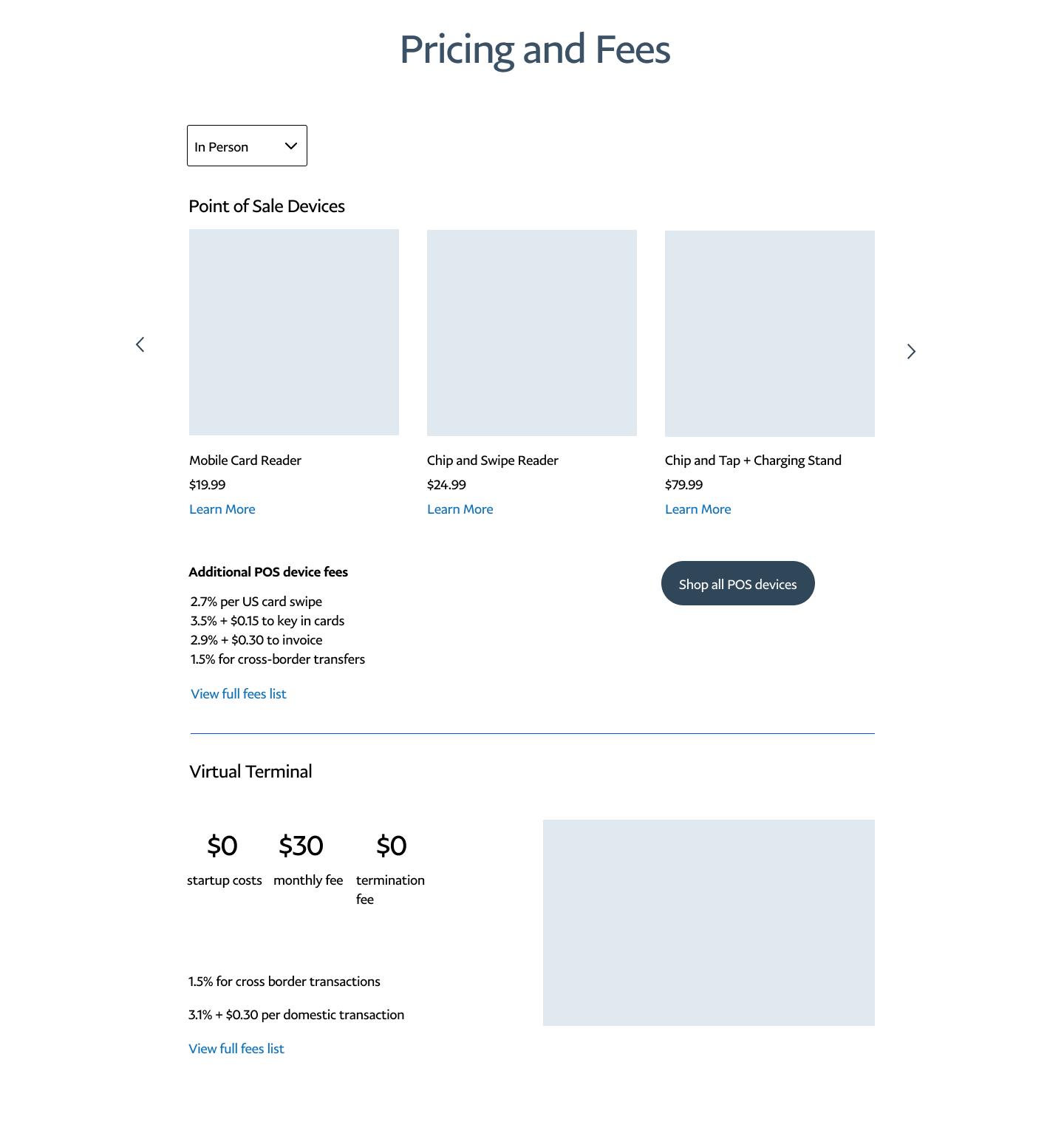
Using all of our research and findings, we sketched out basic wireframes and incorporated what we learned from our testing and interviews to prioritize the right types on content for each audience. Our UI design team created simplistic illustrations and a complete UI kit which we applied to our wireframes.
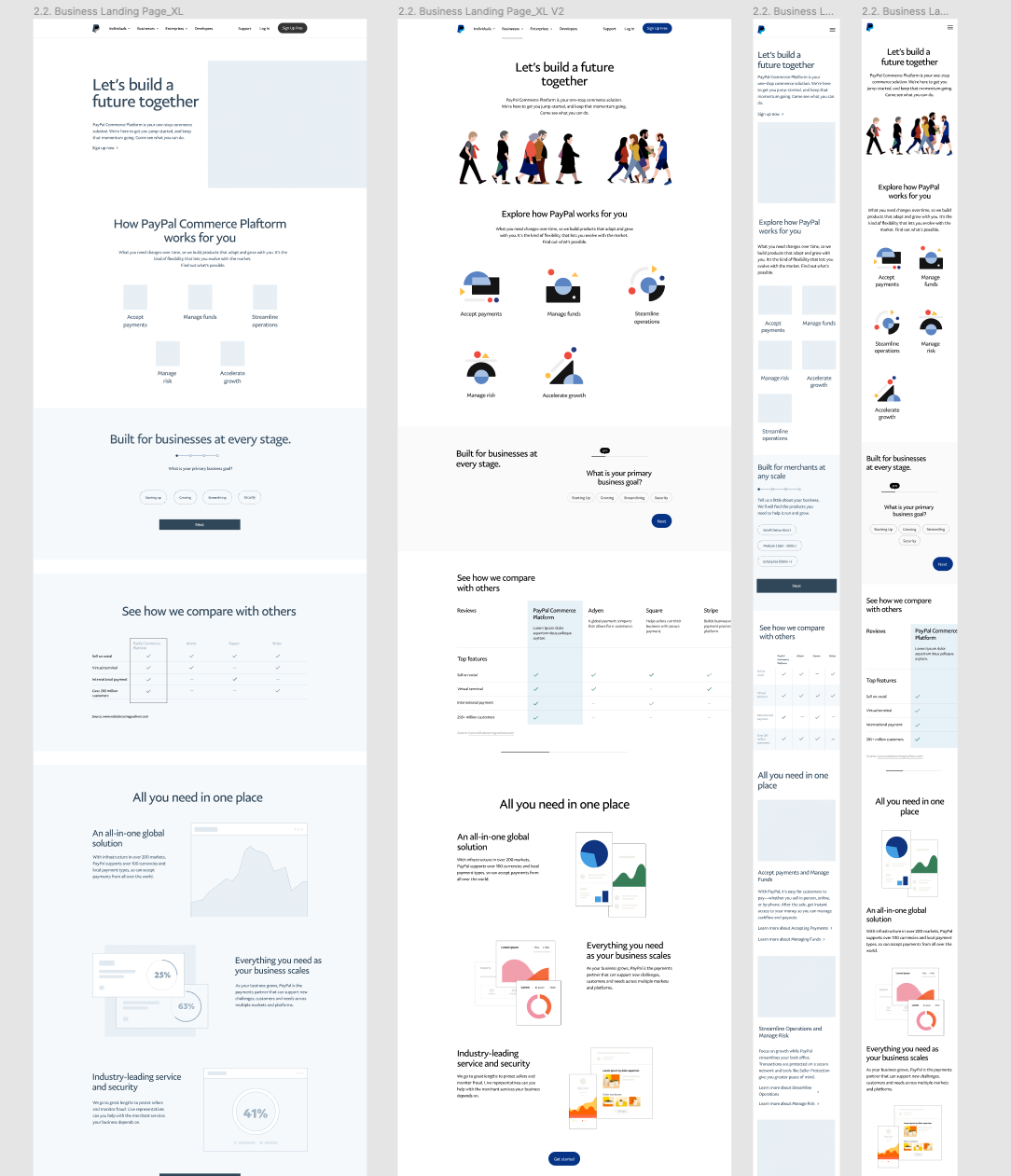
Responsive design of the Business landing page
Accept Payments and Sell Goods and Services pages
Measurements for success
To measure our success, we planned to do client follow ups and gauge metrics related to conversion.
Near Term:
Comprehension - product comprehension facilitated by PayPal.com
Sign Ups - sign up completion rates via PayPal.com
NNAs - 30 day activation rates of PayPal.com sign ups
Time spent on pages past the homepage
Time spent on pages prior to closeout
Rate of sign ups outside of primary top level CTA
Longer Term:
MAU - PayPal.com monthly active usage
Cross-Sell - new paid services adopted as a result of cross-sell on PayPal.com
next steps
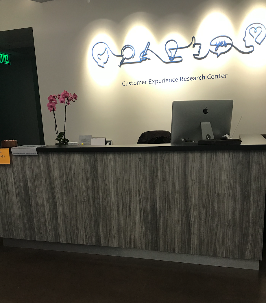
As a result of COVID-19, this project has been paused and is scheduled to resume in July. The usability testing with mid-fidelity wireframes are scheduled to take place at PayPal’s customer experience lab in San Jose. The users included in the first phase of testing will include SMB and enterprise merchants. Consumer and developer work streams are to be conducted at a later time.
See More work
Twitch: Hire an Artist

Twitch Elevated Chat
Jiffy Lube