
Twitch Elevated Chat
Monetization Feature
The Customer
Viewers and streamers on larger Twitch channels. Chat on these channels are fast moving and therefore harder to keep up with.
GOAL
We (Twitch monetization team) wanted to build a valuable way for viewers to interact with streamers and for streamers to monetize and recognize their community for their monetary support.
Solution
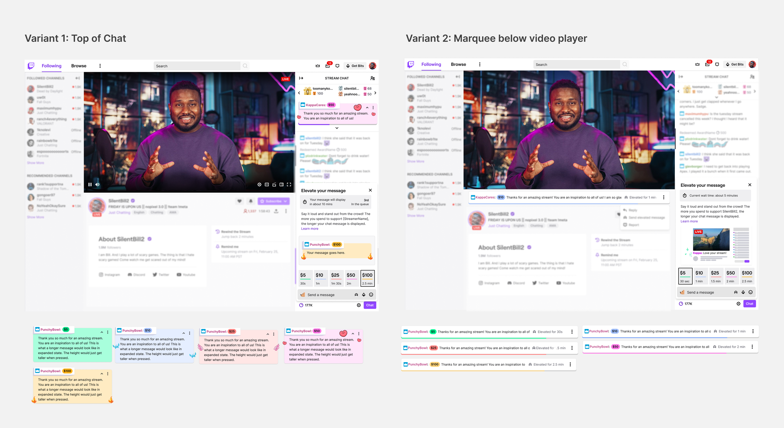
We tested two variants: 1) Top of chat and 2) Below the video player to see which was the optimal space for recognition.
Background
As a part of a larger initiative at Twitch to make ‘cheering’ (the act of supporting a streamer through monetary actions) simpler and more rewarding for streamers and supporters, we tested a concept where viewers could pay to pin a message to the top of chat to increase the likelihood of recognition from the streamer. This hypothesis was based on:
Our UX research showed that streamer recognition and interaction is the top reason why users pay on Twitch.
The success of our other features on Twitch (10% of Channel Point redemptions are to highlight a message)
The popularity of 3rd party alerts and interactions that elevate messages
Other platforms allowing users to pay to elevate their message
Define
Viewer Experience user flow
Viewers need the ability to discover the new feature, understand and browse the different options, complete their purchase, and see their message displayed. I worked with my product management team to define the user stories and prioritize them.
A few example user stories include:
P0 - As a user, I see the entry point in chat
P0 - As a user, I can see how much I need to spend to elevate a message
P0 - As a user, I can tell what is going to happen when I pay to elevate my message
P0 - As a user, I can see how long my message will be elevated for when picking a SKU
P0 - As a user, when I purchase an elevated message, I enter the checkout flow and see a confirmation page before my purchase is complete
P1 - As a user, I can see my position in the queue (if one exists)
After aligning with product and engineering teams, I created a happy path user flow to demonstrate how the feature could work and meet both user and streamer needs.
The viewer purchase experience (click to enlarge)
Design
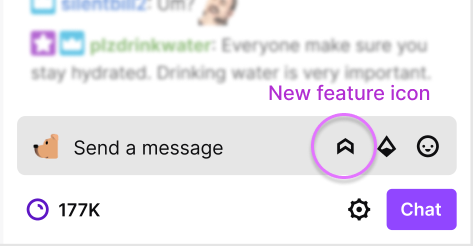
multiple Entry points
Icon next to other monetary actions in chat
Viewers and frequent chatters are familiar with this space and therefore would easily discover and play around with the new feature by clicking on the icon
Note: This was an experiment so we used an existing icon from our icon library. If the experiment was successful, I would work with our Core UI team to explore and find icons that resonate with the feature.
Entry point 1
2. For more organic discovery, I wanted viewers to be able to see the elevated message in action and easily try it themselves
Entry point 2: Via message display origin point
Variant 1: Top of chat
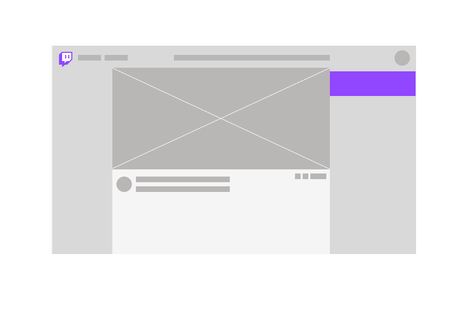
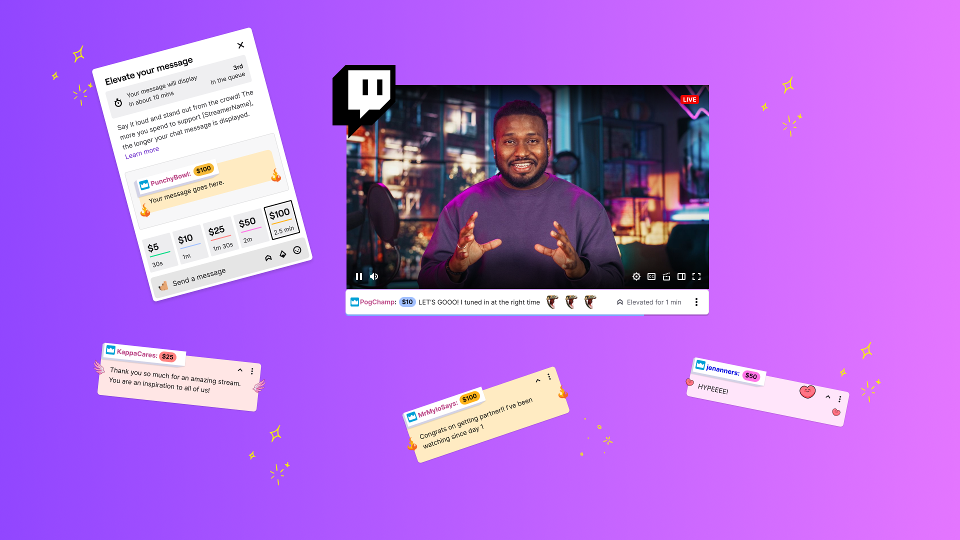
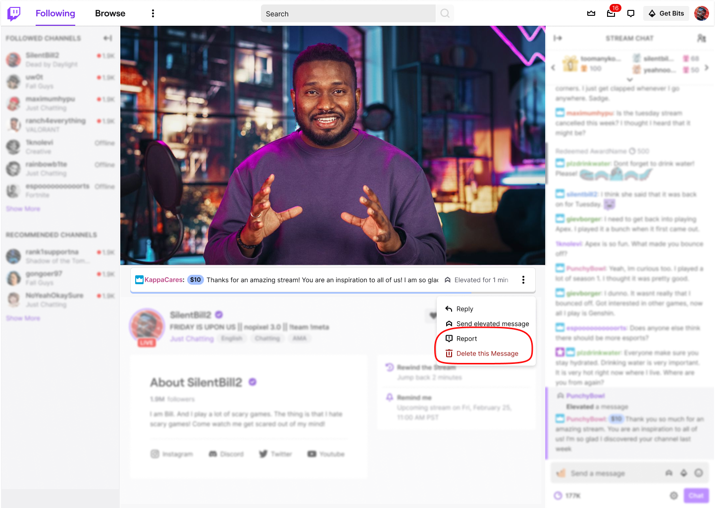
Chat is a very sacred place for Twitch viewers as it is a shared space where they can talk with others in the community. Streamers on Twitch also rely on chat to interact and respond to viewers during their livestream. As such, I decided to explore how an elevated message could live within chat. I felt that an elevated message belonged at the top of chat above other messages because this would add a high value proposition for viewers and it would help streamers prioritize which chat messages to respond to first. Additionally, this space allows the elevated message to live close to the Twitch Leaderboard where top monetary contributions by username are highlighted.
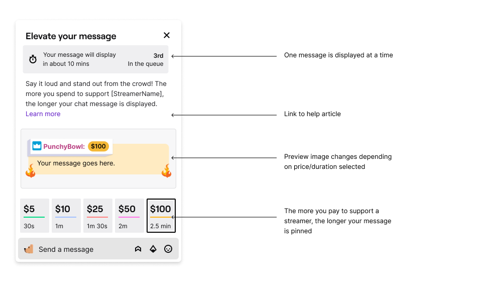
Purchase card
Once viewers click an entry point, they see a card with all the prices, durations, and different visual offerings. The more a user pays, the longer their message would be pinned. The preview image changes and renders their message as the user types. If we had more engineering resources on this project, I would have made the preview and input field be one piece in order to reduce vertical space and redundancy.
Queuing
Our team decided that only one message could be displayed at a time in order to increase the scarcity and value proposition of this new feature. Queues do not exist elsewhere on Twitch so we made it a priority to set user expectations on how long they would have to wait and why.
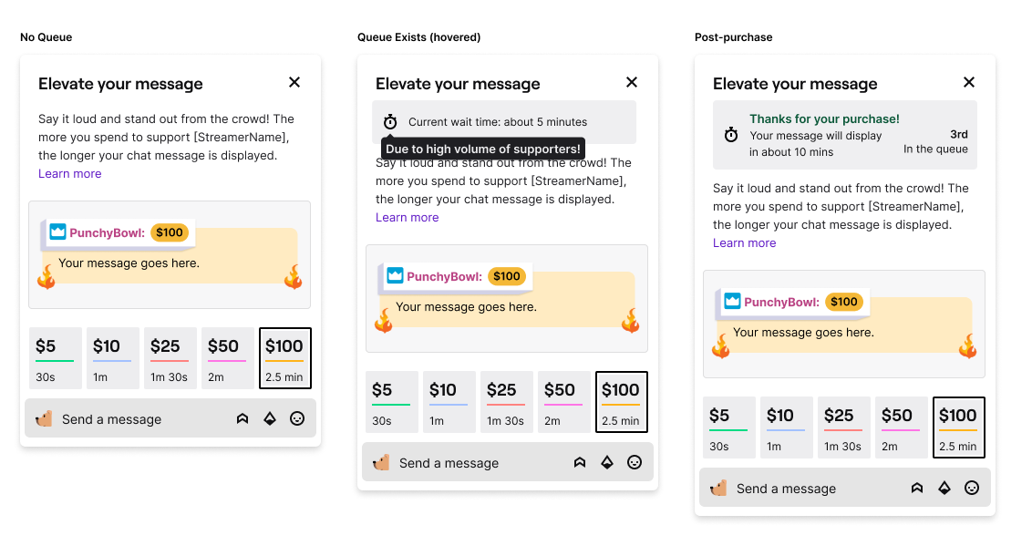
Queue states
Light and Dark mode messages
I wanted to add some personality to each of the price points. I tied the colors on the default card to the color within the purchased message. Twitch is also known for its own emotes (emojis) that can be used in chat so I added these to the final design as a familiar and fun flair.
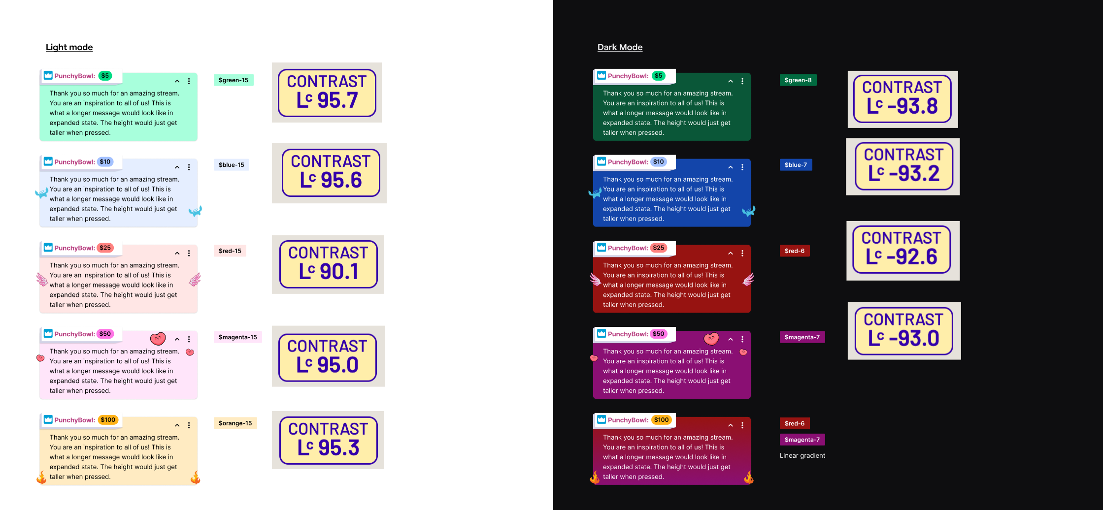
Light and Dark mode messages checked for contrast and accessibility
Card detail
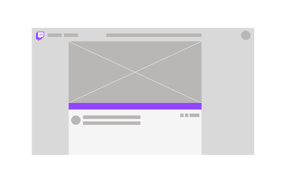
Variant 2: Below the video player
The second variant we decided to test was a message below the video player.
Purchase CARD and EXPLANATORY GIF
Instead of simply telling the viewer that their message would display below the video player, I wanted to visually demonstrate where the message would be pinned.
In the first iteration, I created a simplified ‘wire-framey’ version of the channel page and highlighted where the message would show up (in chat and below the video player). I felt that there could be a stronger representation to help the viewer understand so I storyboarded and created a gif that would live in the card.
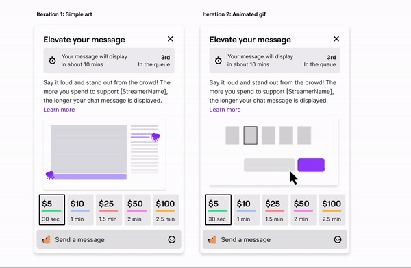
Iteration 2 was the design in the live launch!
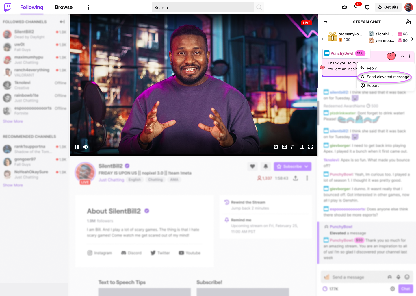
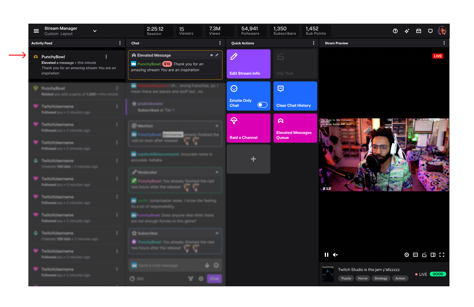
Streamer Experience
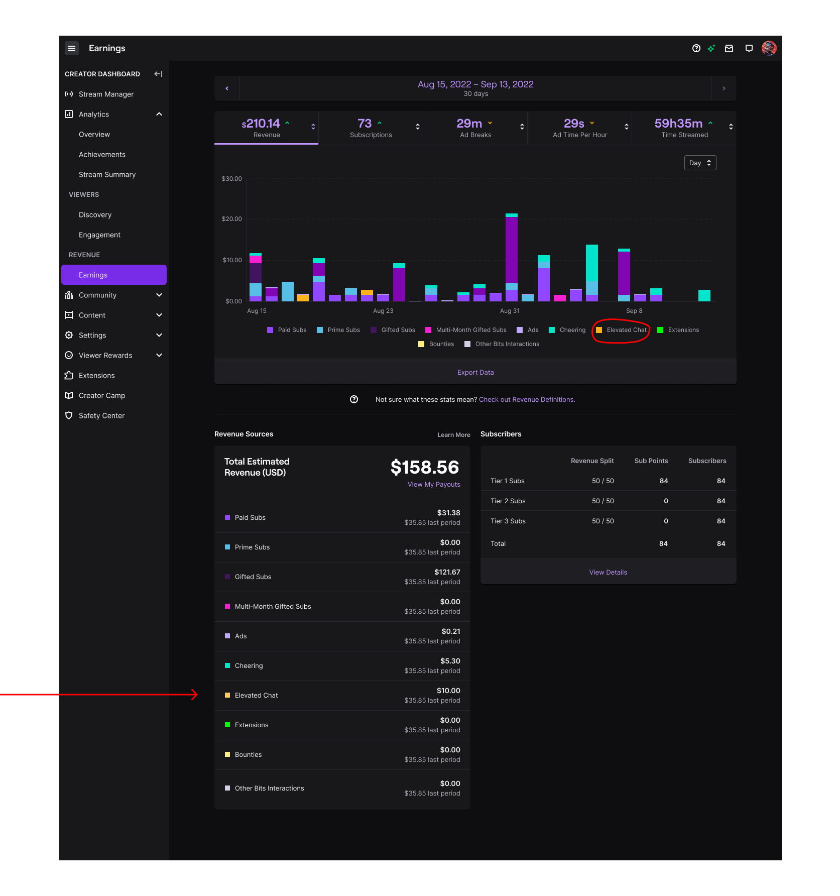
Streamers on Twitch are masters of multi-tasking. I wanted to make it as easy as possible for streamers to recognize Elevated Chat messages in their live activity feed. According to our previous UX research, it is important for streamers to see how much ($) a viewer has contributed so they can thank their viewers. I leveraged ‘Chat Highlights’, a feature on Twitch the outlines certain types of messages using a single line stroke in different colors and icons to help streamers quickly identify notable chat activity. I worked with corresponding design teams on Twitch to decide on a color. I also used this same color to represent Elevated Chats in the streamer earnings dashboard.
USER STories and designs
P0 - As a streamer, I can see when a user has purchased an Elevated Chat in my activity feed
P0 - As a streamer, I can view metrics for Elevated Chat revenue in my dashboard
Trust & Safety
There are two main ways of moderation on Twitch:
1) Automod: an automated program that can be set to different levels to filter out unwanted content and
2) Human moderators: a person unique to each channel and appointed by the streamer. They have the ability to time-out and ban users by clicking their username in chat. They can also delete chat messages.
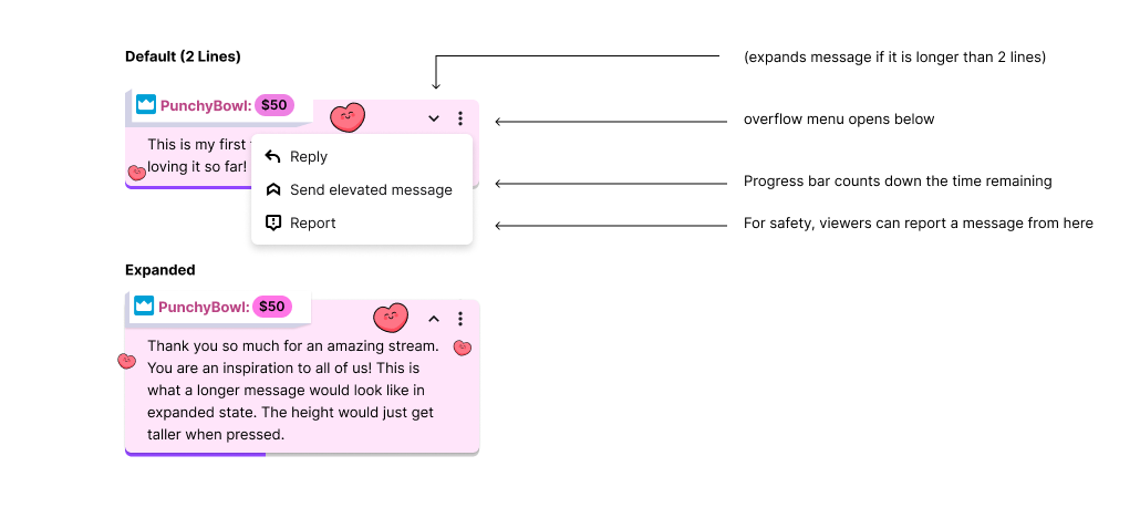
Because of the high visibility and permanence, we applied the highest level Automod on all channels when Elevated Chat was enabled. Additionally, messages in both variants can be deleted by moderators and streamers from the origin point in stream chat & via the overflow menu next to where the message is displayed.
Viewers have the ability to report a message from the same overflow menu.
Outcome and next steps
This experiment launched in Q4 2022 and the Top of Chat variant performed better (exact metrics are private information that cannot be shared at this time). In the follow-up survey to experiment participants, users felt that they wanted to customize the price to pin duration to fit their channel size.
Prior to getting laid off from Twitch, I was working on the second iteration of this project which will be a full rollout to all monetizing streamers. This version had the following updates:
Ability for streamers to customize price and pin duration
Multiple messages can be pinned at once
Users can react to messages, using Twitch and custom creator emotes
measurements for success
Revenue as compared to other types of cheering mechanisms on Twitch
Feedback from qualitative survey sent to streamers and viewers
See More work
Twitch: Hire An Artist
Jiffy Lube